Branding - Clarobenz+

Overview:

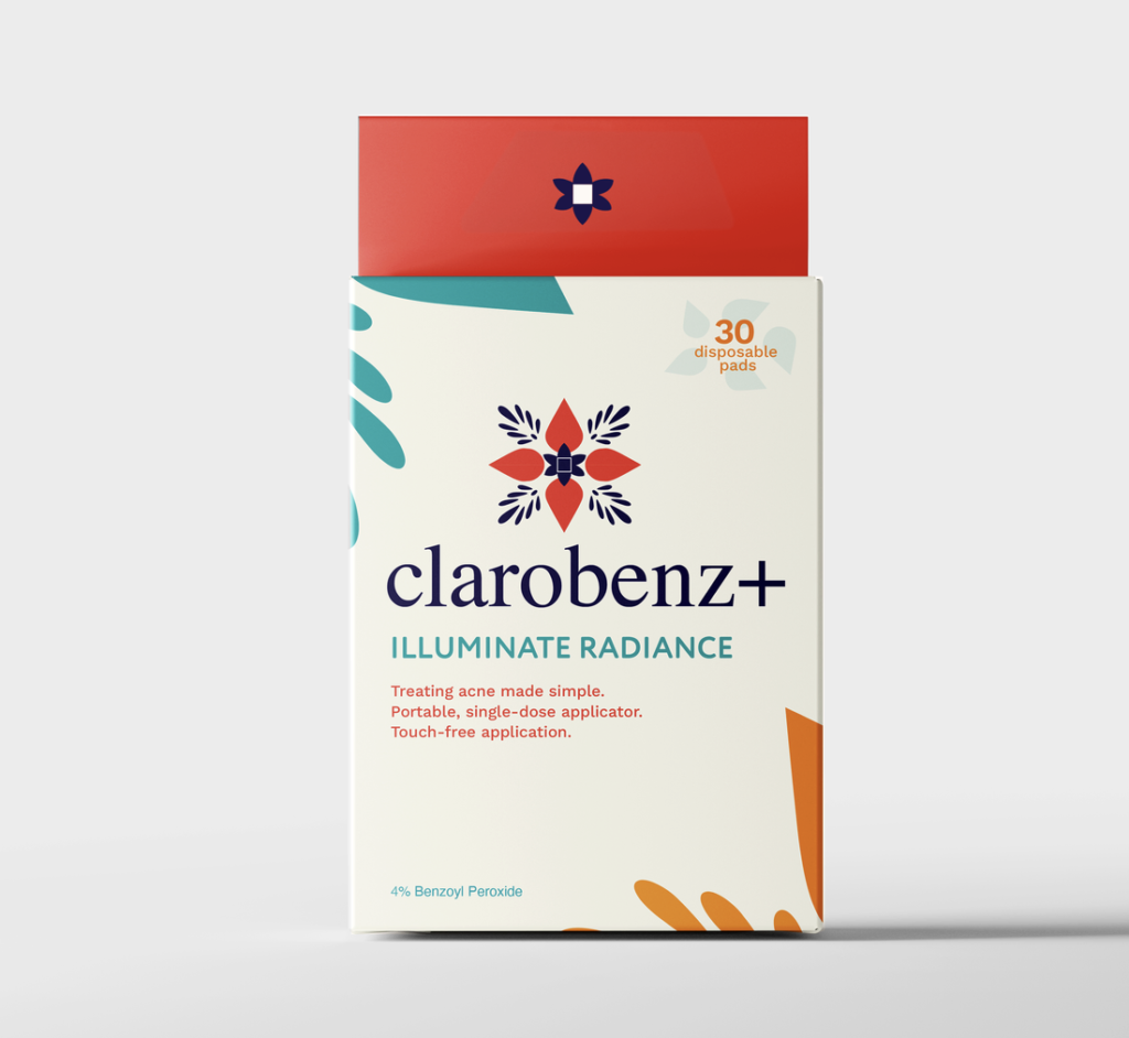
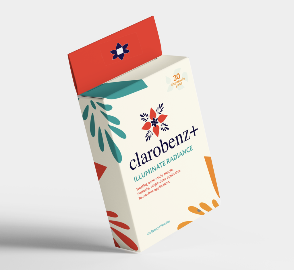
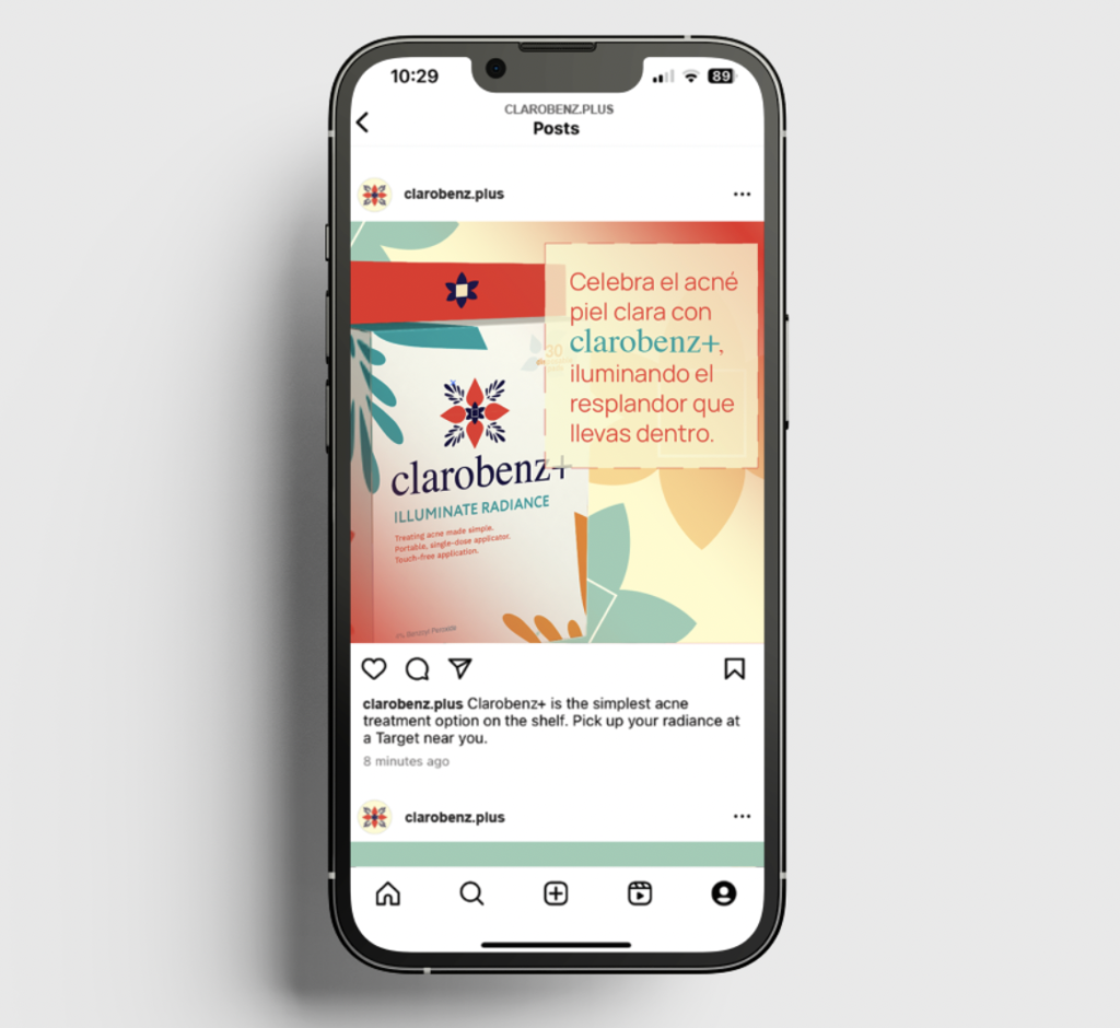
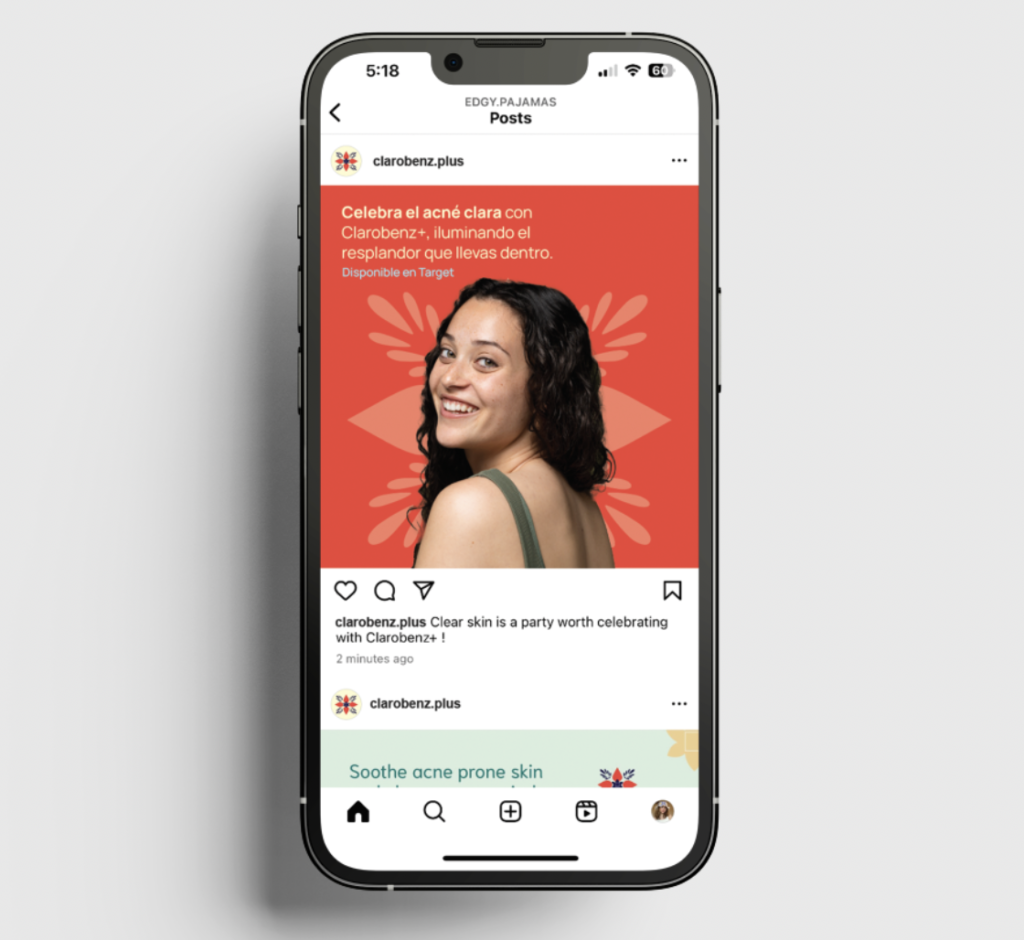
Clarobenz+ is a drugstore skincare brand tailored to active, young Latina women looking for fast, effective acne treatment throughout their day. The product features portable, no-touch wipes that make skincare easy for any time at any place.

My task was to design a brand identity that highlights both the product’s convenience and its results to position Clarobenz+ as a reliable and top choice acne solution. My main question was, what could make this stand out on the shelf? 

Solution:

I had the logo be inspired by Latino tile art, while exploring the idea of radiant skin and feeling fresh. 

From researching popular Latina skincare products, I decided I wanted the packaging to feel bright and instill confidence. Many Latinos are said to feel shame and not seek help for their acne. I wanted to create a design that was warm and inviting, showing the audience that they can feel beautiful both inside and out. 

Process Logo Sketches: